Thesis: Two Sides of One Line // 저는 선을 걸어요
︎ Print Design
︎ Poster Design
︎ Product Design
︎ Laser Cutting
︎ Editorial Design
Boston University
2021
Overview
Two Sides of One Line // 저는 선을 걸어요 is my thesis project—the culmination of my studies at Boston University. Revolving around my identity as a half-Korean, half-white biracial individual, my thesis work pulls from research, personal experiences, and stories to encapsulate the co-existing joys and struggles of being biracial. Through the exploration of typography and symbols from both Korean and English cultures, my thesis manifested as a series of objects: a poster, a board game, a language-learning tool, and a book.
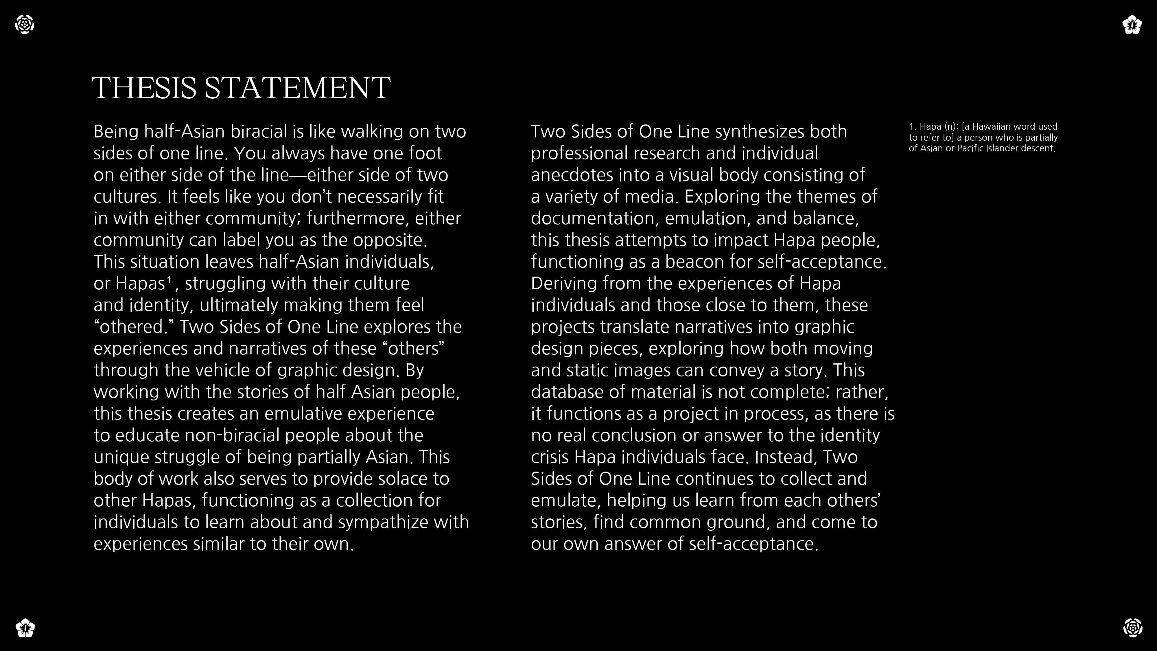
Thesis Goals
- To create a place of solace for Hapa individuals, where one can read and learn about the experiences of other Hapa peoples.
- To educate non-Hapa individuals about the unique struggle of being half-Asian, and create a learning experience for people to learn how to talk about culture and ethnicity with half-Asian people.
Methodology Map
Being honest, I felt lost at the beginning of my thesis, even though I knew I wanted to design something around my cultural identity. To jumpstart the process, I started by diving in head first with a methodology map. I wrote down all the aspects of being half Asian that I struggle with, that frustrate me, and that I’m proud of. I then began to take my map a step further, incorporating the intersection between my identity as a graphic designer and my identity as a Hapa individual. This addition resulted in a set of concentric circles, with my half Asian experience living within my experience as a human and graphic designer.
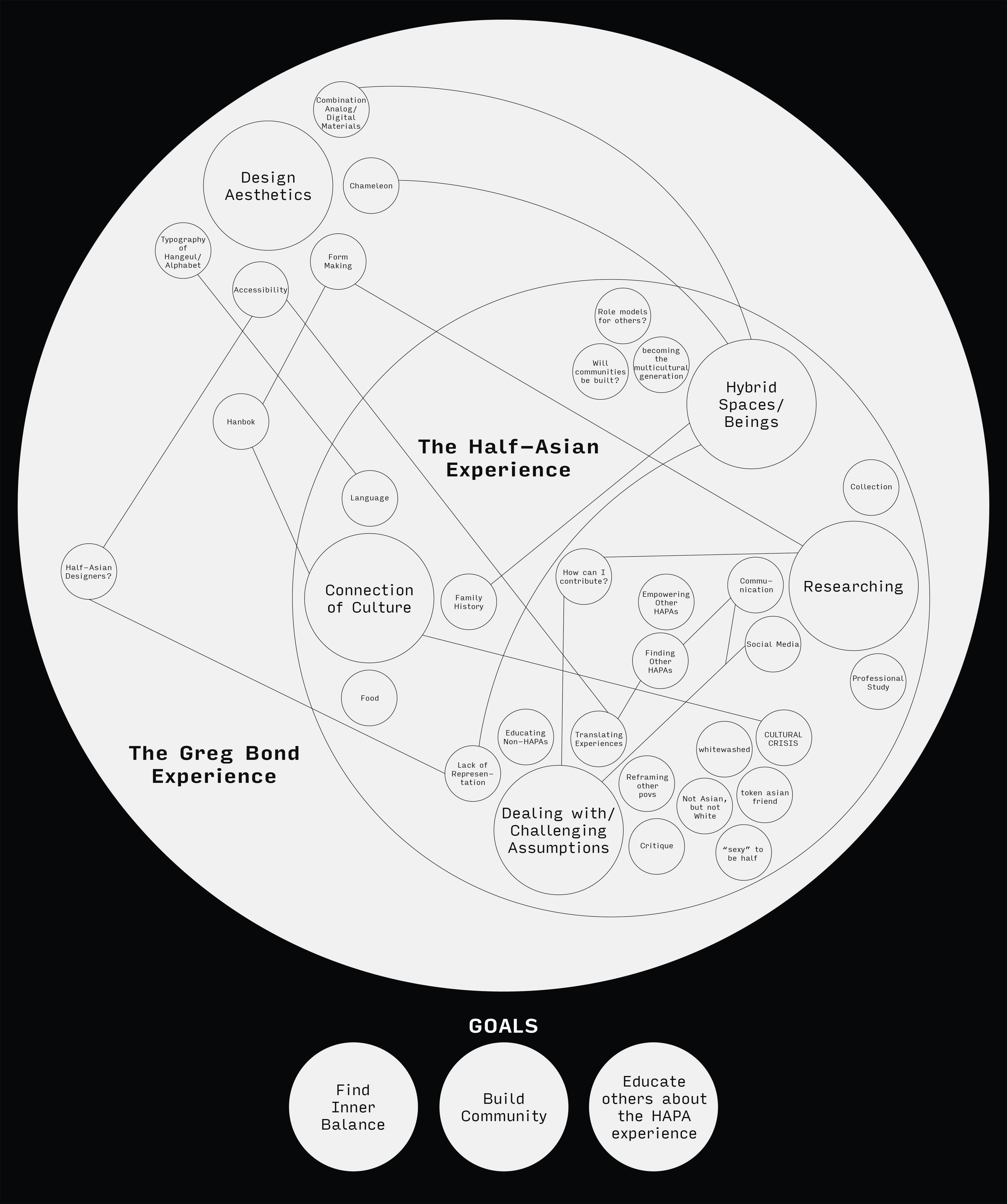
My methodology map, which proceeded to fuel my thesis projects
I also listed out my thesis goals on this map, located toward the bottom. By the end of my thesis, I don’t think I fully fleshed out or realized these goals, but I can say that I made progress towards each of them. Moreover, I plan to keep working towards them as a post-graduate, both for myself and my design practice.Projects:
I Walk the Line
“I Walk the Line” is the first project I created for “Two Sides of One Line” after creating my methodology map. At the beginning of my thesis process, I wasn’t too sure what to begin designing, so I began with a familiar medium: the poster.

“I Walk the Line” final poster
This poster centers around my identity as a half-Asian individual, incorporating a number of assets that I feel concretely link me to my culture. To start, I began by observing the hanbok from my childhood, which is littered with symbols from head to toe, including numerous flowers. I began to sketch one of these flowers in my sketchbook, and thought to use it as a larger structure within a poster. Afterwards, I brought in one of my anecdotes from a past project, specifically, my very first memory regarding race in elementary school. I also chose to incorporate symbols from my grandmother’s sewing patterns, to honor her part in creating the person I am today.
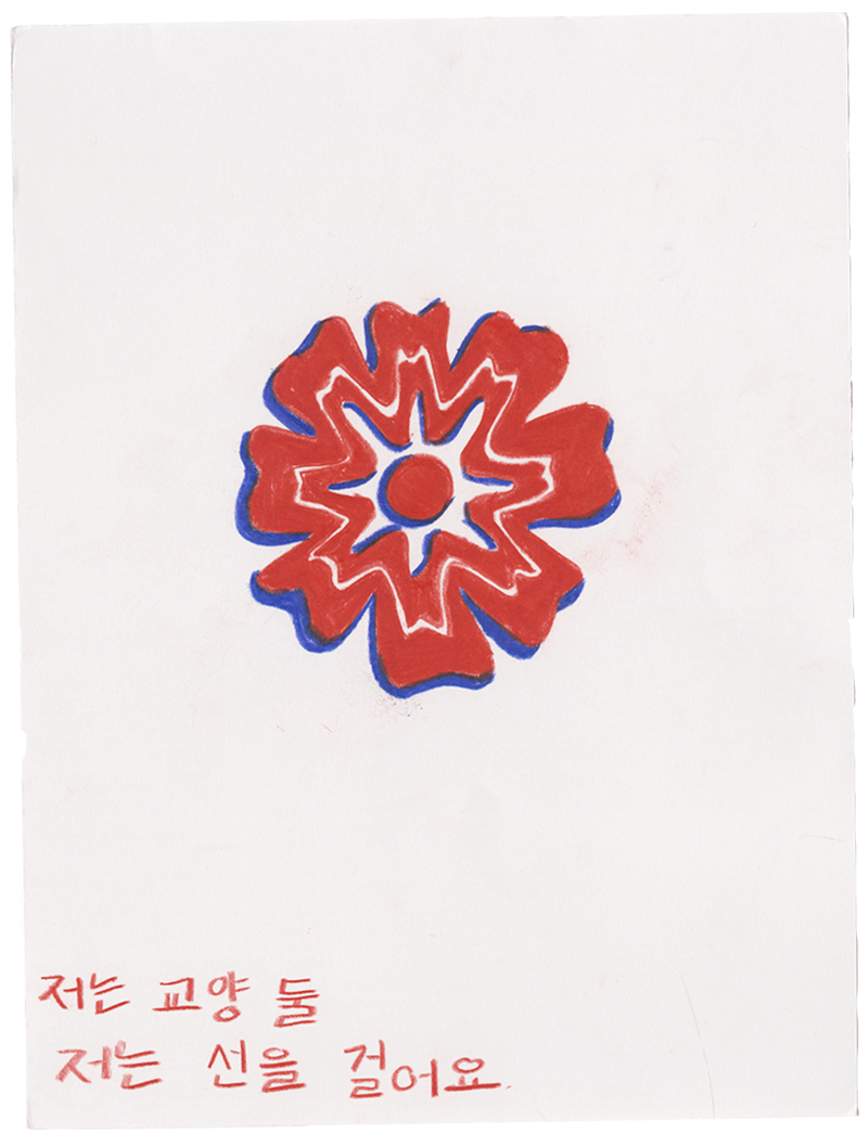
My original sketch of the flower on my hanbok, later used within my poster


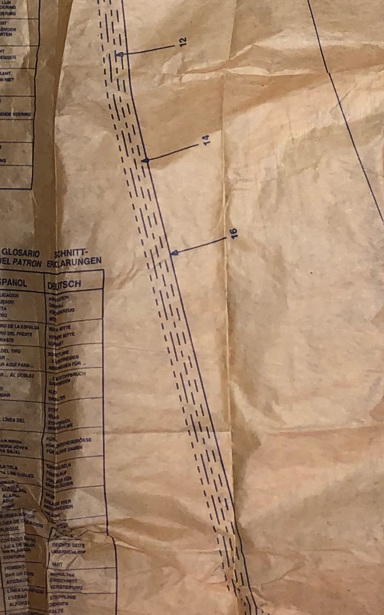
Close-ups of my grandmother’s sewing patterns
This poster functioned more as an iterative warm-up for my thesis, flexing my design muscles to prepare for later, more fleshed out projects. Most importantly, however, this poster resulted in the Korean name for my thesis, 저는 선을 걸어요, translating to “I walk the line”. I was particularly proud of this additional name, as I took my language education from my Korean I and II classes and applied it to my graphic design practice—something I hope to continue as I learn and grow both a as designer and language-learner.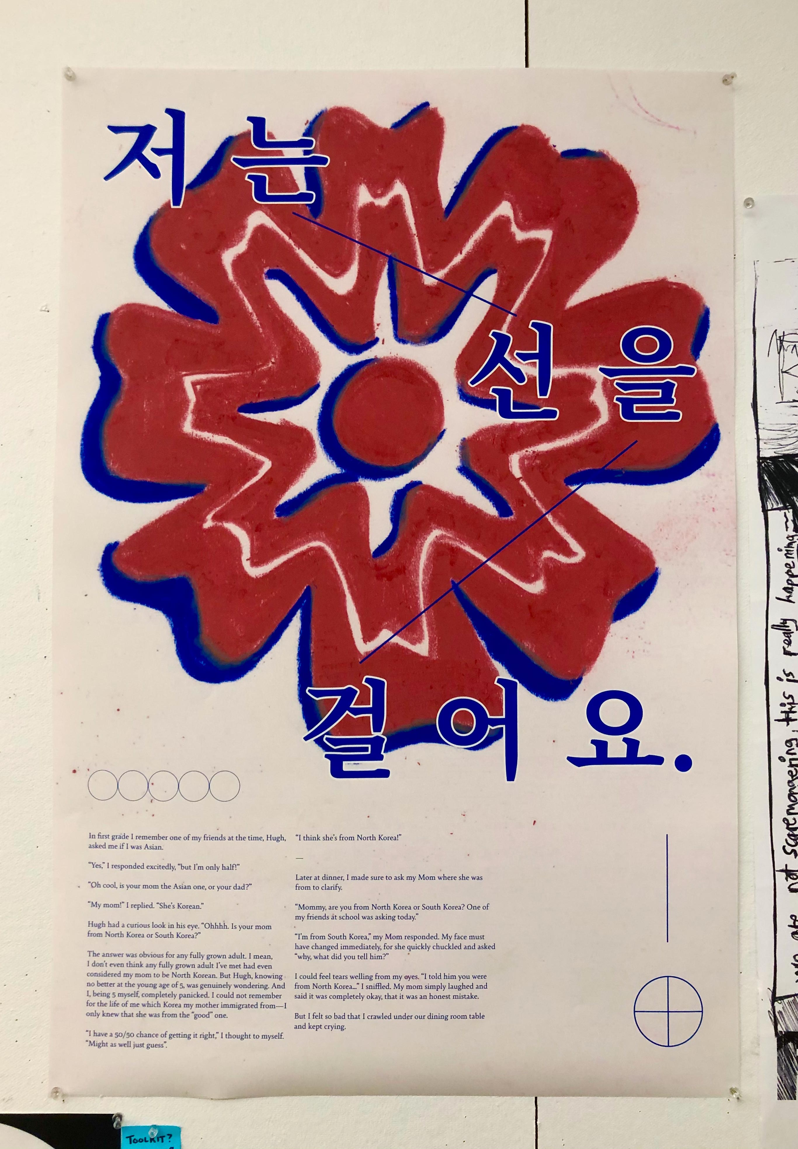
Common Culture
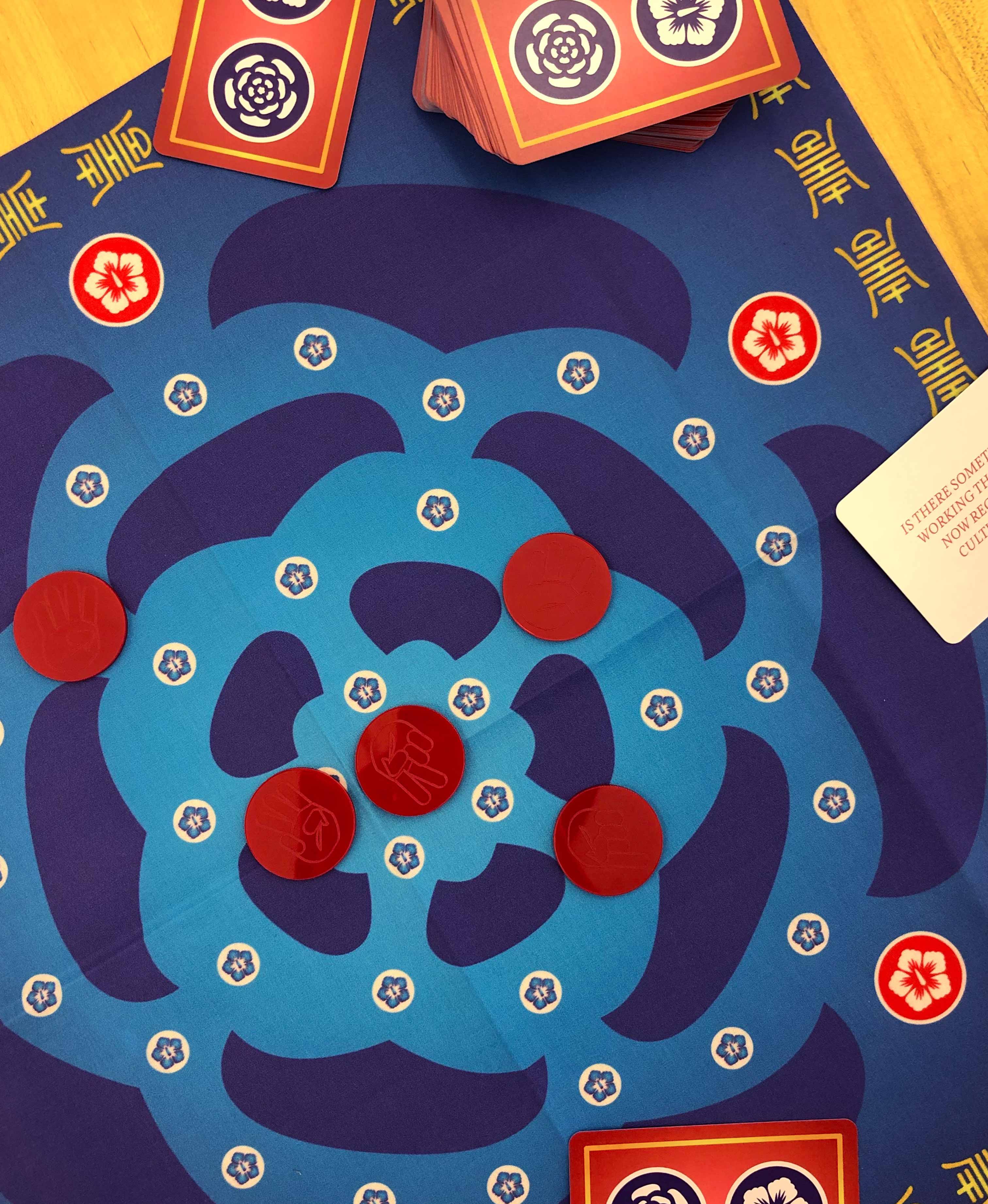
“Common Culture” is my second and main thesis project: a board game centered around finding common ground with others through the lens of culture. The board game consists of three parts: a fabric board, a deck of cards, and a set of playing pieces. “Common Culture” can be played with 2-5 players.
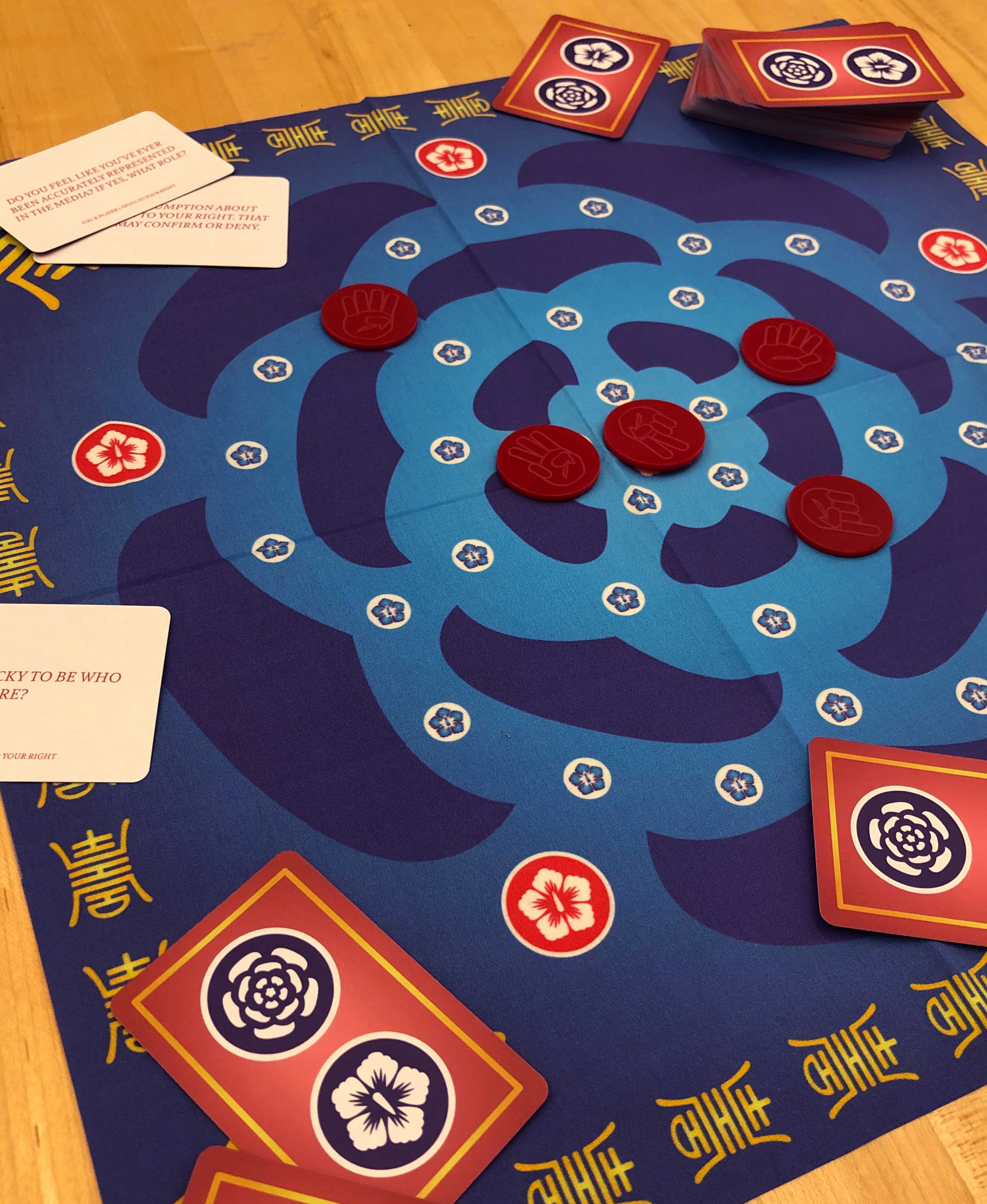
The final version of “Common Culture”
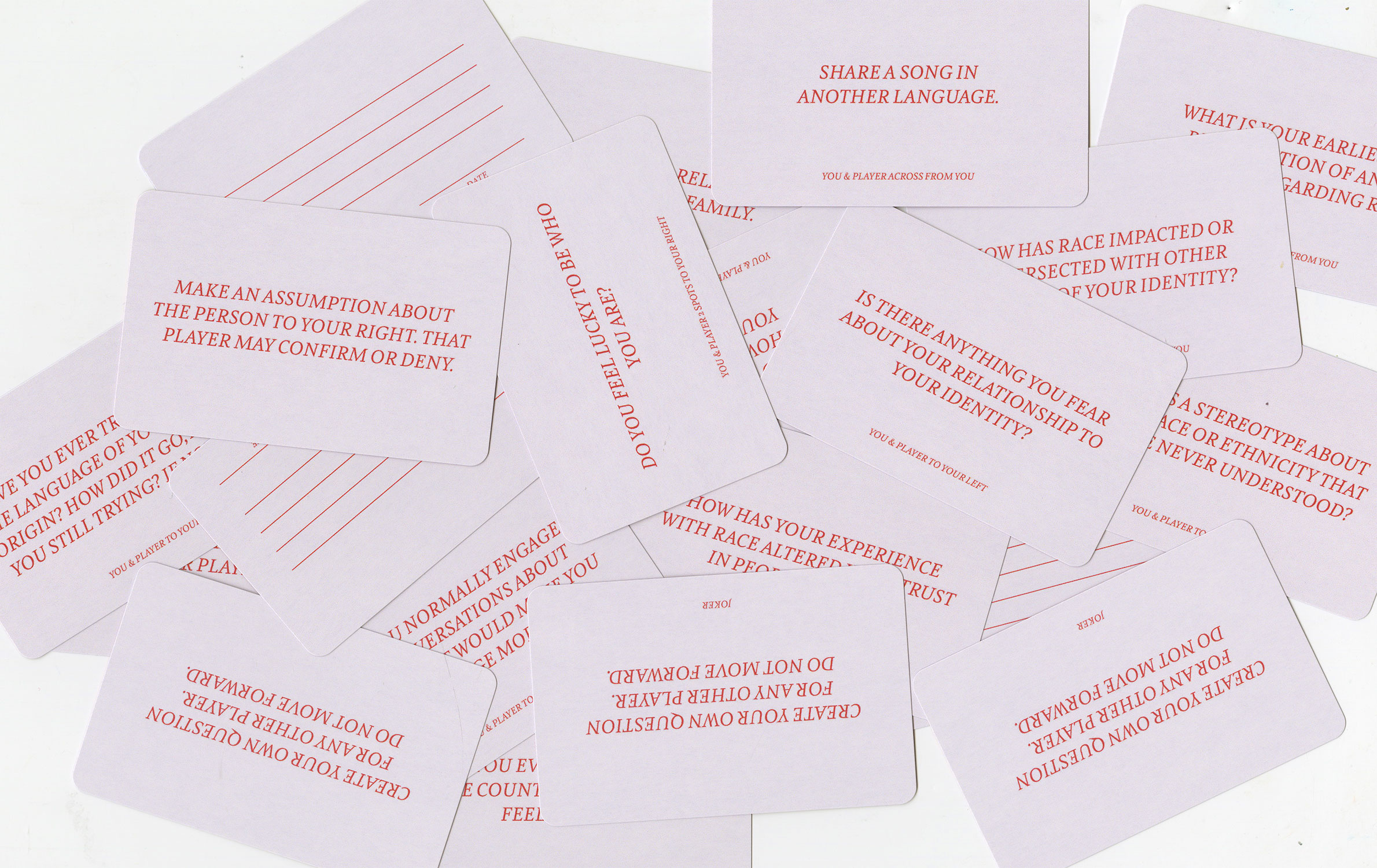
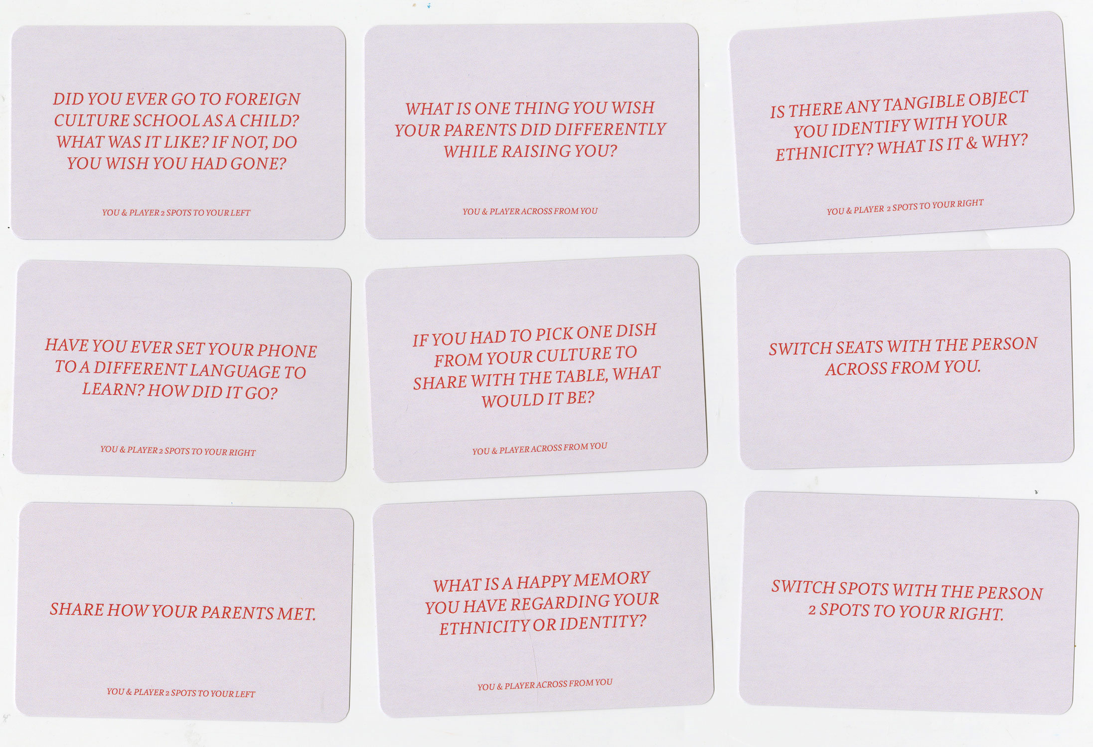
The goal of the game is to learn more about the other players’ culture(s) through finding common ground. To play, each player places their piece on the red hibiscus symbol located at the edges of the board. One player then draws a card, which has a prompt or question regarding culture, and an indicator to tell which players will respond to the prompt. Once those two players answer the question, they may each move their piece one spot closer to the center. The game ends when all active pieces are stacked on the white hibiscus symbol in the center of the board, thus leaving all players connected. Once the game is complete, players may choose to fill out a blank card with a prompt of their own for future players.
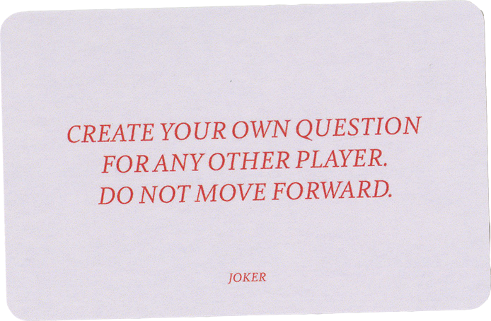
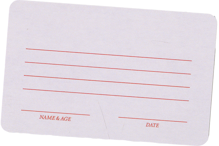
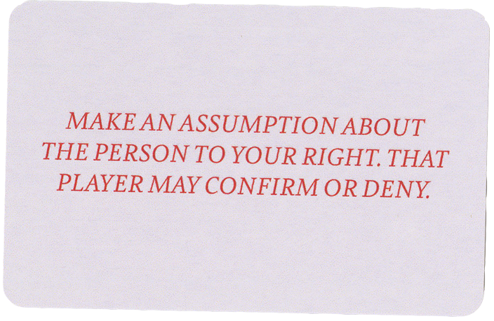
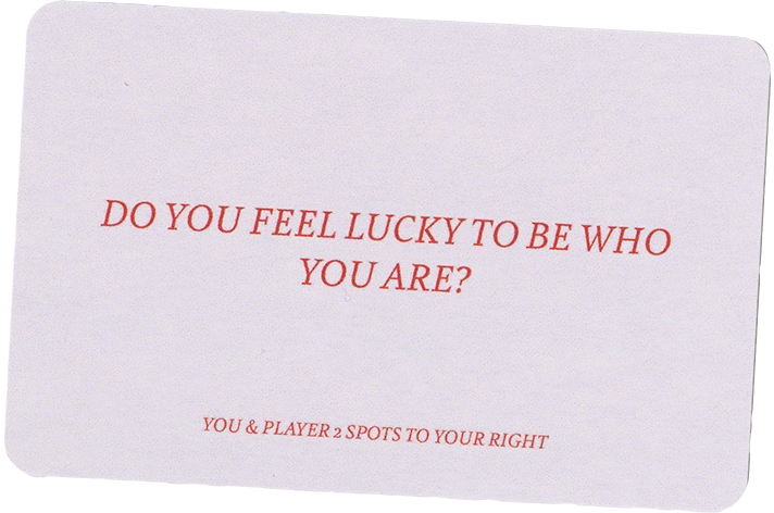
Select cards from the game’s deck
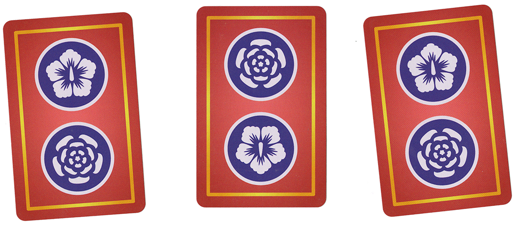
Card back art
After creating “I Walk The Line,” I was drawn to dive deeper into the flower motif as a symbol of culture. After some research, I found out that the national flower of South Korea is the common hibiscus, and the national flower of the United States is the rose. I already knew I wanted to create some sort of experience for my viewer, so I decided to continue my work from “Two Sides of One Line (Borders Book)” and create a new and improved board game, incorporating these flowers into the board’s overall structure. What resulted was a board with a rose as its main formation, with hibiscuses sprinkled throughout, evocative of my upbringing in American culture with bits of Korean culture mixed in. The ornament around the edges of the board are informed by the 복건, or headpiece, of my childhood hanbok. These forms are derived from Chinese characters, used to represent a wish for good fortune, happiness, and a long life.
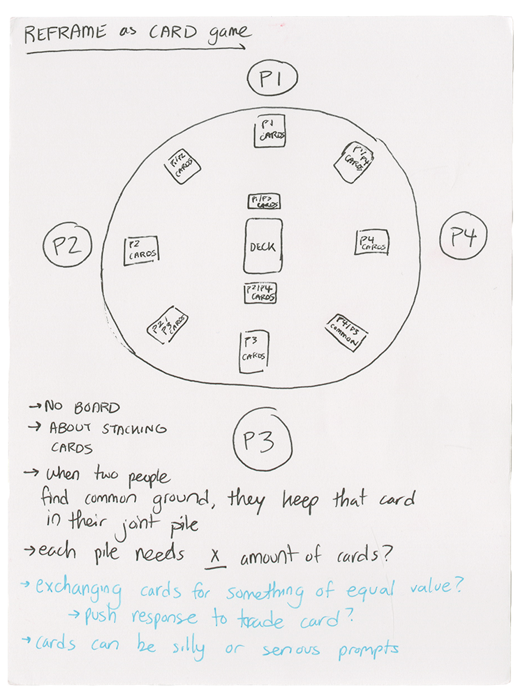

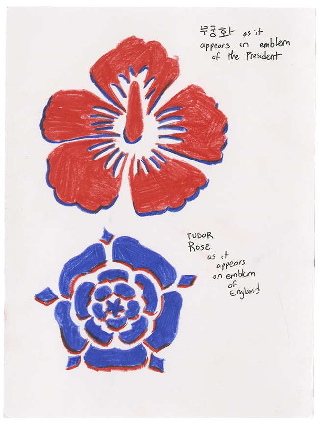
(above) Initial board sketches for “Common Culture”
(below) Symbol research on flowers for the game’s board
(below) Symbol research on flowers for the game’s board
I designed “Common Culture” with many blues and reds, as these colors are both apparent in the flags of South Korea and the United States. I love how the game came out, and I hope to push it even further some day, making it more accessible for players everywhere.

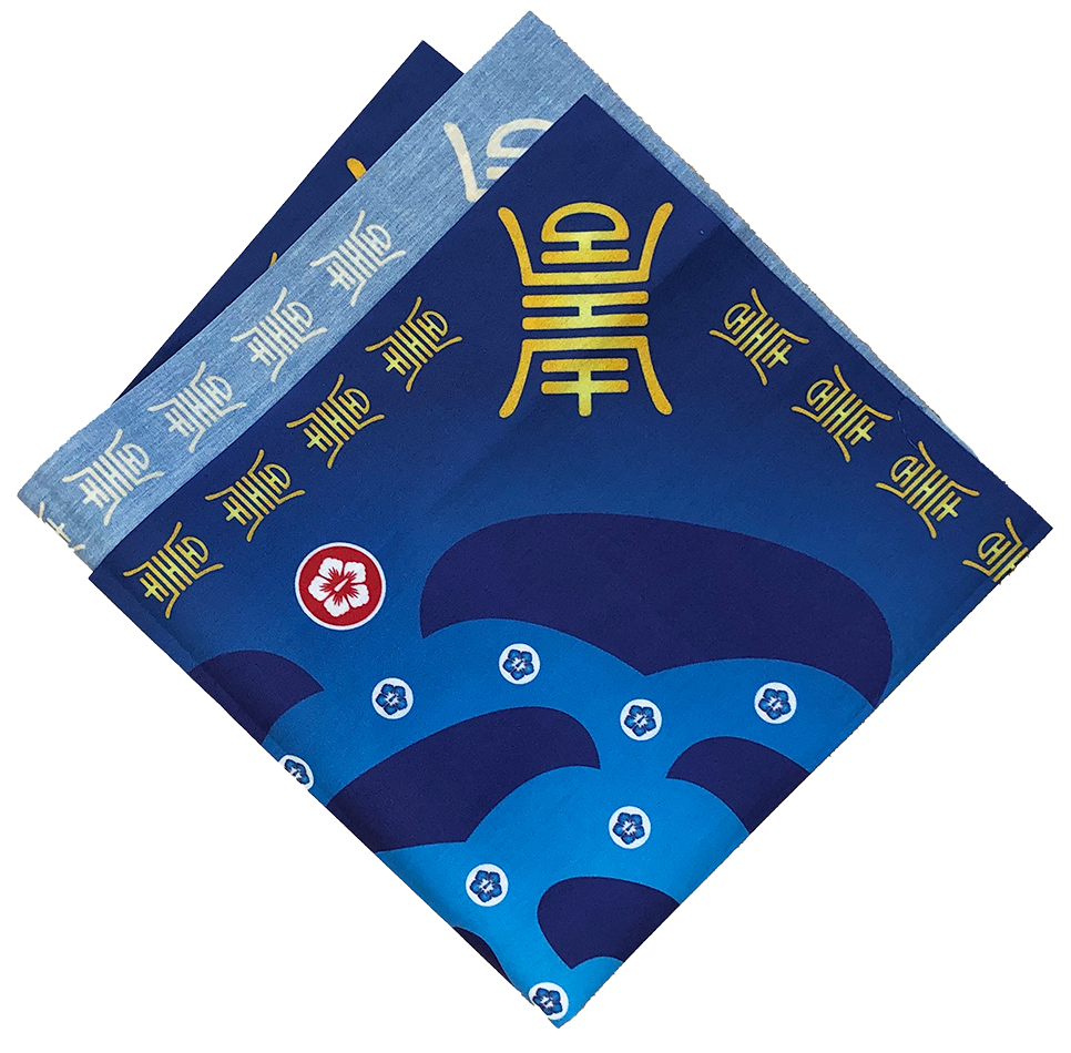
Printed on cotton fabric, the board is easily transportable and storable. The gold ornament around the edge of the board is derived from Chinese characters, used to represent a wish for good fortune, happiness, and a long life.
![]()


Initial card sketches and iterations, along with the final deck
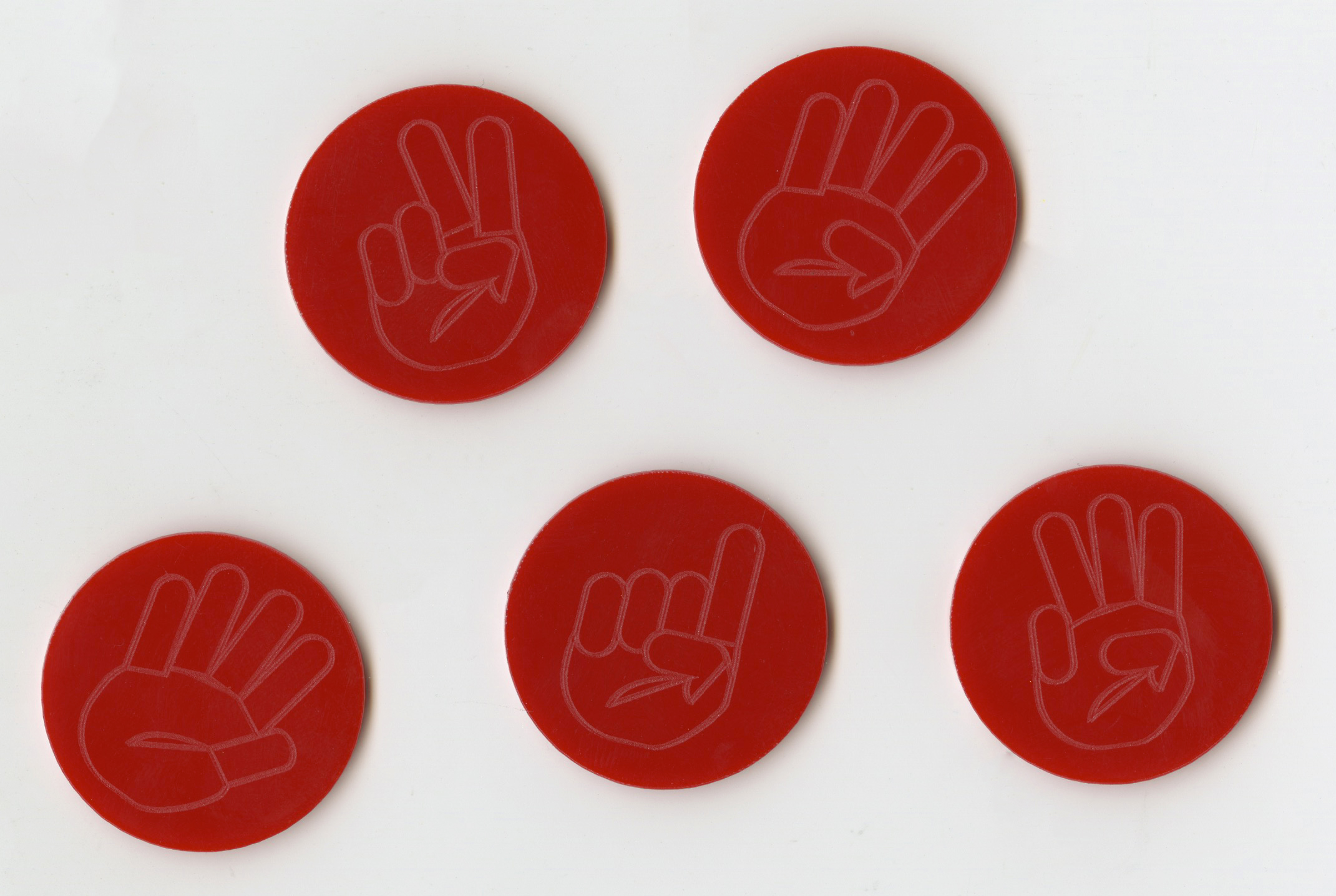
The game pieces, laser cut and engraved. The pieces use fingers instead of numbers to be more inclusive to all players, regardless of cultural background.

Korenglish
My third and final project for my thesis is called “Korenglish: A Modular Type Learning Tool”. I designed this tool for children growing up in Korean and English speaking households to aid in their bilingual education. Growing up, most, if not all, of my educational toys were centered around the English language, despite the fact that my mom spoke Korean. My parents did not raise me speaking both languages, thus, I wanted to design a tool that I wish I had as a child to assist in growing up bilingual.
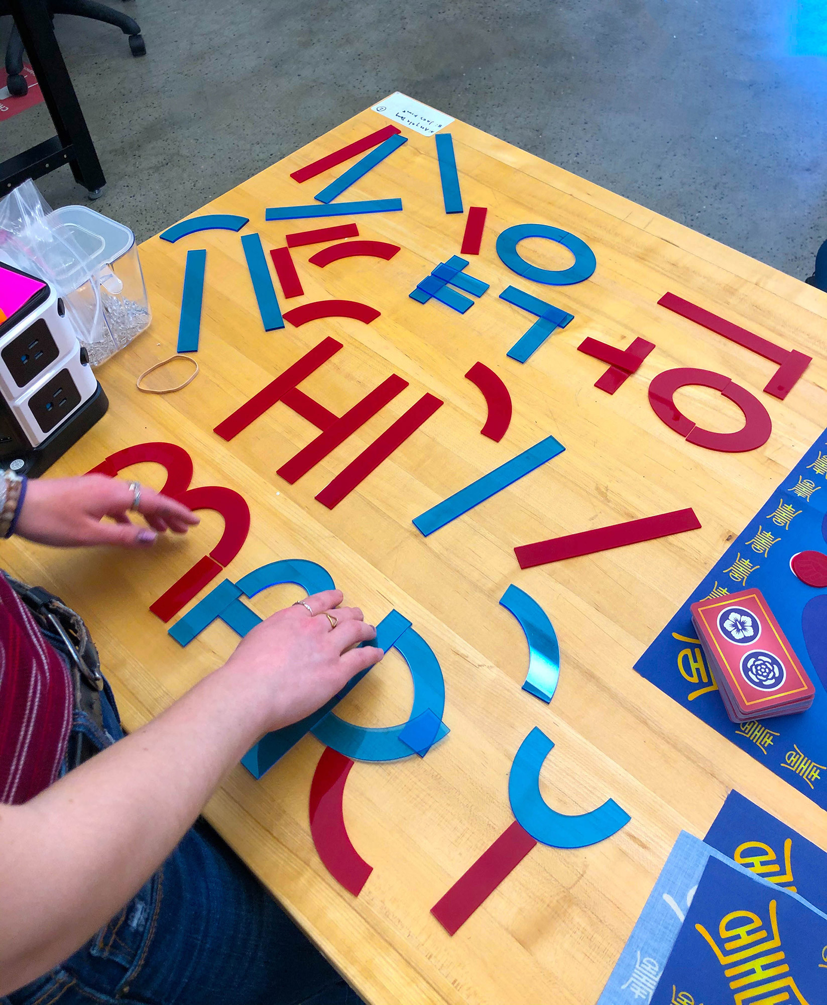
Experimentation with “Korenglish”
“Korenglish'' started as a typeface experiment in my sketchbook. I was looking at the Korean characters on my laptop’s keyboard, and recreating them with marker when I realized that not many different strokes were required to create the whole Korean alphabet. After further examination, I realized that the English alphabet also didn’t require too many shapes either—a few lines, some curved marks, and a rounded form here and there. After this epiphany, I created a prototype of “Korenglish” with cut out pieces of cardboard, resulting in only 4 different shapes that could make the entirety of the alphabet and hangeul.


The beginnings of “Korenglish” development
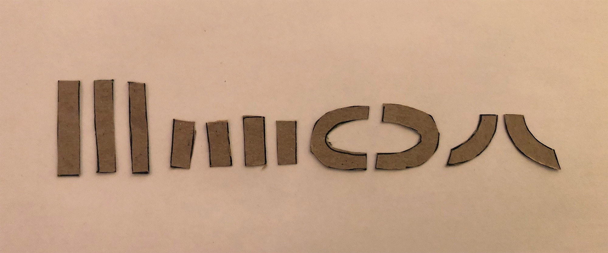
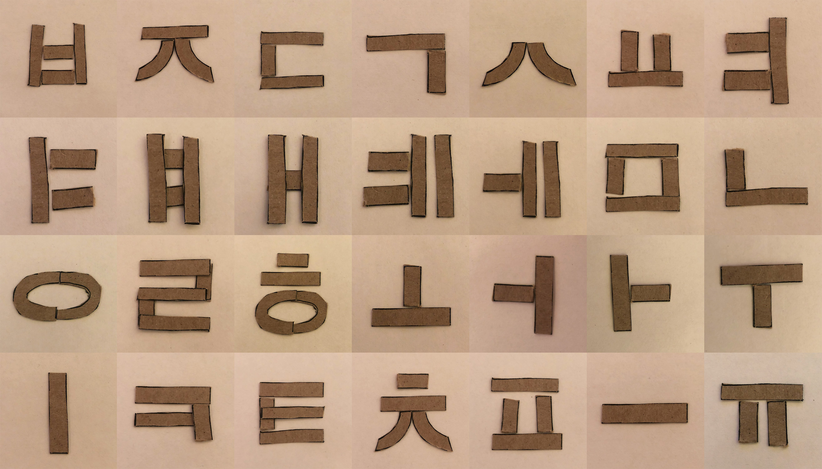

Interestingly, I found that with only 4 forms, I was able to make the entirety of Hangeul and the Alphabet
After prototyping, I cleaned up these shapes in Illustrator, purchased plexiglass, and brought my materials to BU’s engineering facilities to be laser cut. My final product consists of these plexiglass shapes, which are able to spell any word in English or Korean.

The entire “Korenglish” suite
Similar to “Common Culture” I chose to use red and blue plexiglass, as these colors are apparent in both the national flags of Korea and the United States. I also used one transparent sheet and one opaque sheet of plexiglass to highlight my experience in being half—a combination of two different cultures.


These plexiglass shapes are able to spell any word in English or Korean
Thesis Book
My thesis book covers the projects above, in addition to past work that correlates to my thesis and my research in preparation for these projects. The covers have a gradient transitioning from blue on the front to red on the back, rooted in the blue and red color scheme that flows throughout my thesis projects. Additionally, all the title information is in English on the front and Korean on the back.
This thesis book is the longest and most comprehensive book I’ve designed through my four years at Boston University. It stands at 202 pages, 5” x 8”, hardcover. Please feel free to flip through here on Issuu.

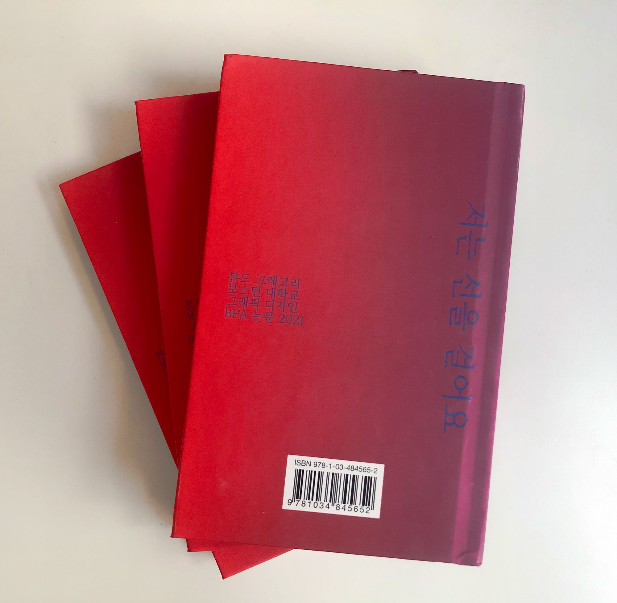
The front and back covers of my thesis book
Conclusions
Humorously enough, I don’t really feel like I reached any lightbulb moments about my identity while working on my thesis. I think I was expecting something to suddenly click—by working so hard on one subject, something would have to fall into place, right? Rather, I think through this process I’ve slowly become more comfortable in my own skin and in my liminal space. Instead of an “ah-ha!” moment, I noticed a stability slowly growing within me over the course of my senior year, and will continue to grow through the rest of my life. I don’t think there’s ever going to be an answer regarding being multi-cultural—I simply think I’ll continue to grow more confident in who I am: a being that lives between.

Select shots from my thesis projects