Felix Doolittle Decorative Labels
︎ Product Design
︎ Print Design
︎ Project Management
︎ Photo/Color Editing
Felix Doolittle
2022
Overview
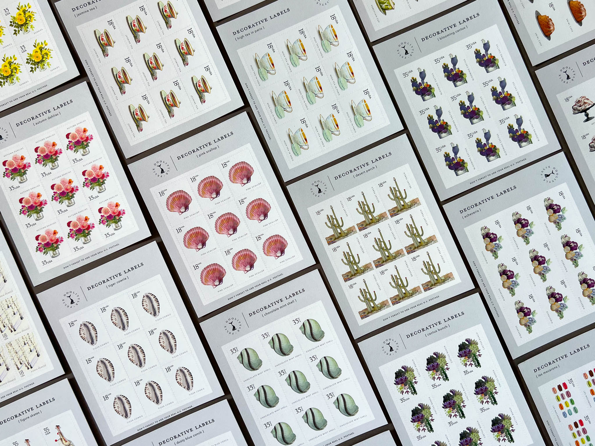
During my time as a Junior Graphic Designer at stationer Felix Doolittle, I spearheaded the development of two new product lines. One of these new products was our Decorative Labels, labels meant to look like US postage stamps to add a decorative flair to envelopes and scrapbooks. This product is part of an initiative to draw a younger audience to the Felix Doolittle brand, whose sensibility typically attracts customers from an older generation. Amid this round of development, our team was able to produce 10 sets of 4 decorative labels each, totalling at 40 new labels.
Process
The first (and perhaps the most difficult) step in creating this product was sifting through the Felix Doolittle image library to put together and pitch a number of potential label sets. With thousands of images to choose from, creating a limited amount of sets was no easy feat. However, I was able to piece together around 25 sets of images that I believed would be popular for customers, which our team then narrowed down to our final 10 sets.
After deciding the sets we would move forward with developing, I began to work on the design of the labels. I had previously laid out the images within the tiny stamp canvas; however, I still needed to explore typography for these labels. I mocked up different typeface options, playing with numbers and alternate characters within each font, and working with the placement of the illustration name. After pitching a few options, our team decided to move forward with Mr. Eaves San OT Book and Californian FB Regular as our two main typefaces.
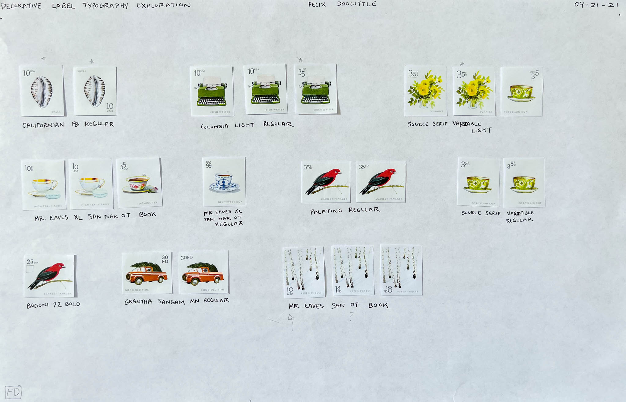
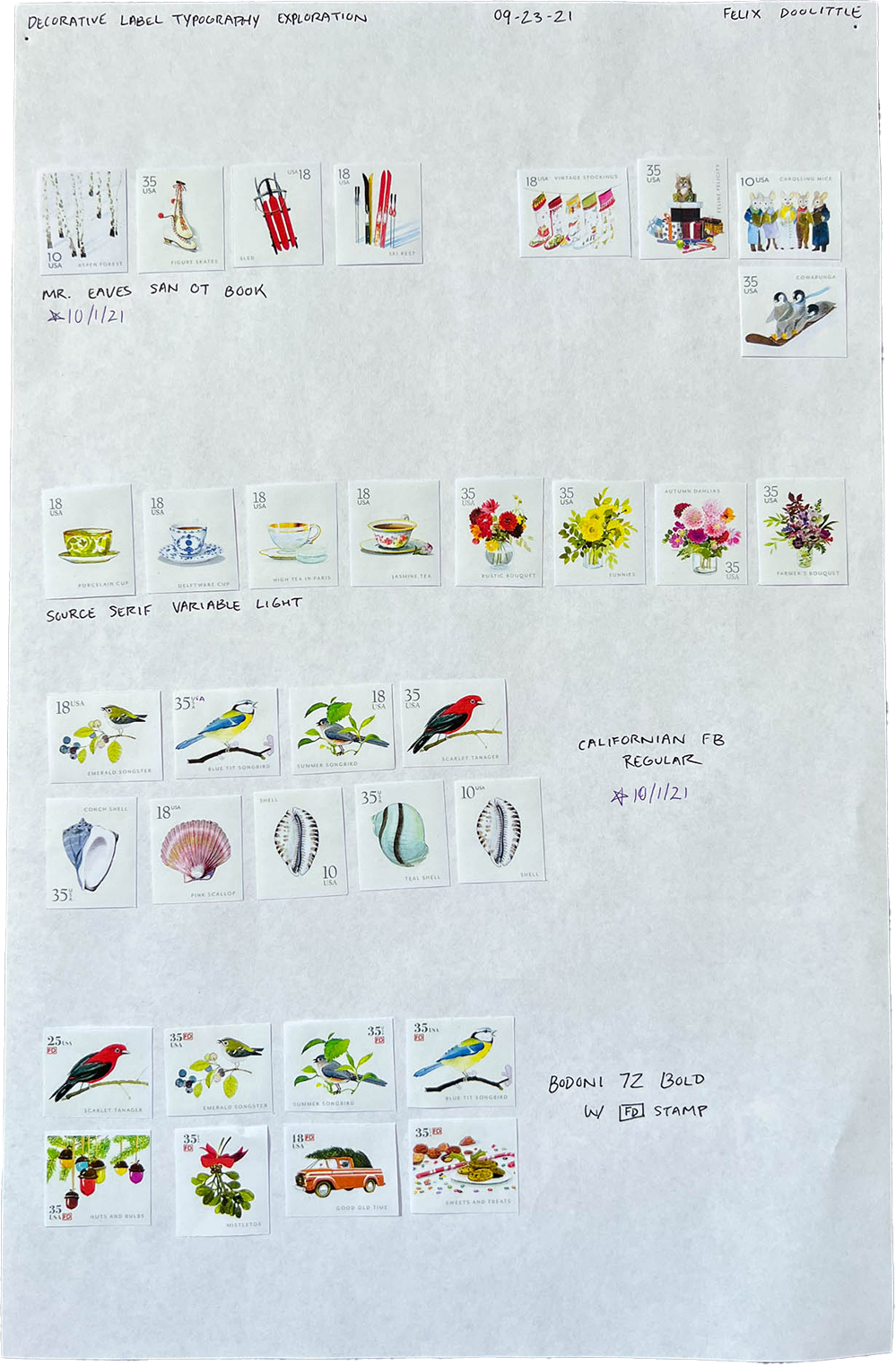
I tried out a number of typeface options, but we landed on Mr. Eaves San OT Book and Californian FB Regular as our main two fonts

Our final ten sets, complete with typography
Once we had decided on typefaces, my next task was to figure out how these labels would fit into one presentable, sellable sheet. I spent a lot of time conceptualizing, finally landing on an A2 size sheet that would hold 9 stamps, meaning a full set of four illustrations would contain 36 stamps. Our team also spent some time deciding whether we should make stamp sheets that were perforated or die-cut; however, our manufacturer let us know that the latter would be easier to attain. The decision was thus made for us—we would have a custom die made for the production of our labels.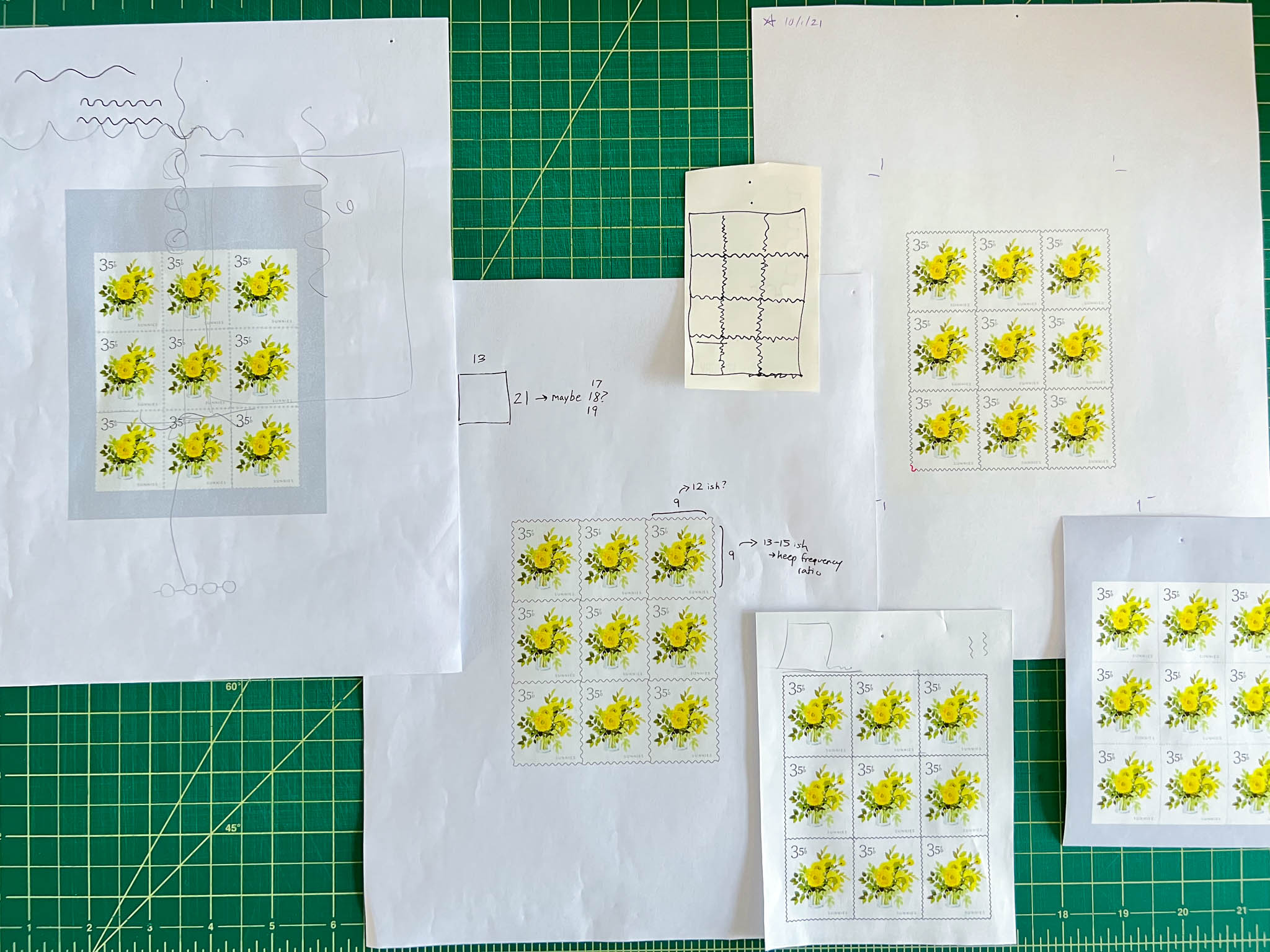
It took a bit of math and a lot of time in Illustrator to get our stamp lines just right
I tried a few different layouts for these sheets after deciding how many labels could live on a page. Ultimately, I landed on one vertical and one horizontal version of the sheet to contain the vertical and horizontal labels, respectively. Our team briefly considered using color on these pages, but conclusively decided to go with a dove gray, allowing the Felix Doolittle illustrations to shine. With this decision, we were ready to order the full production of our product.
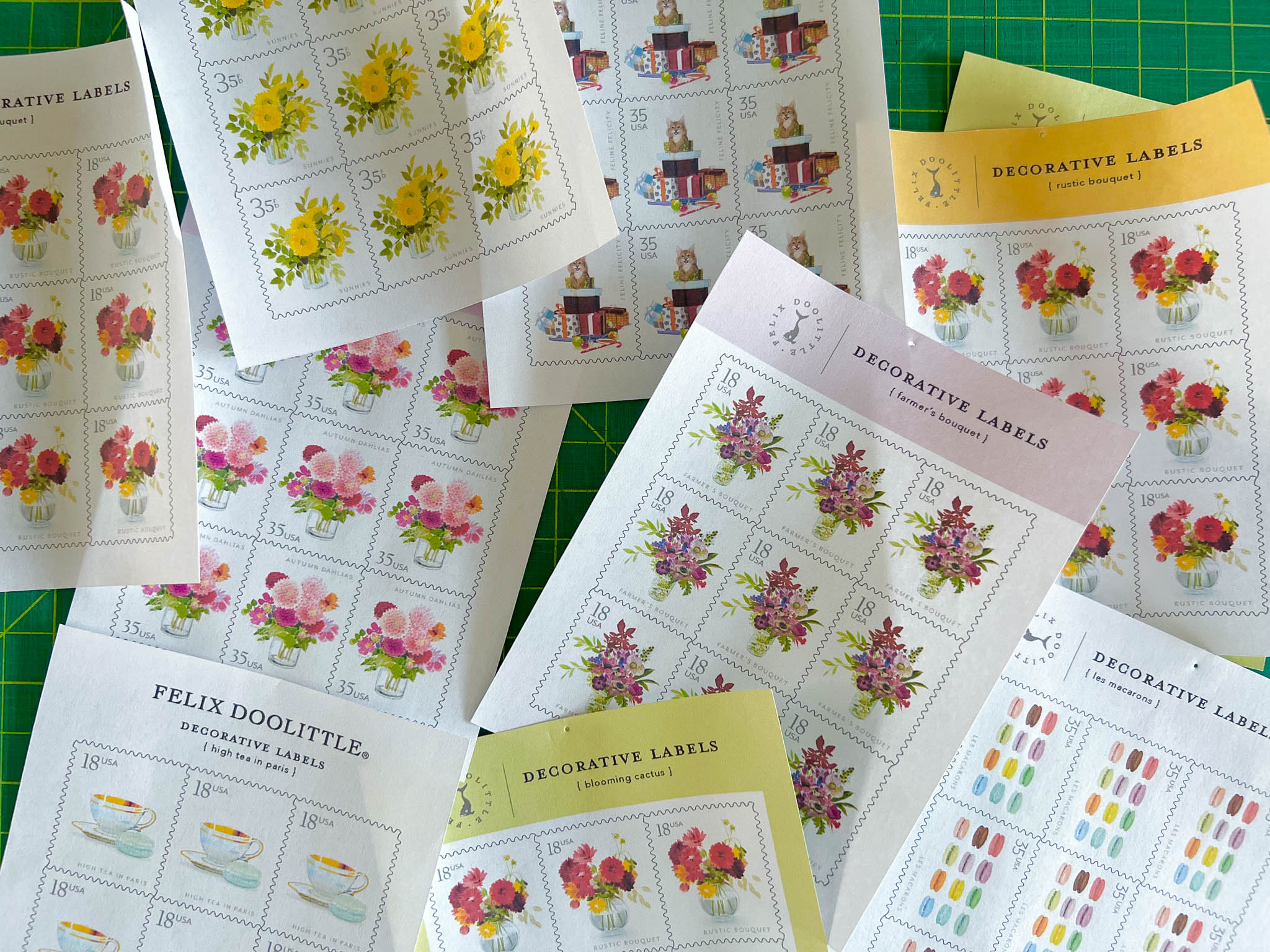
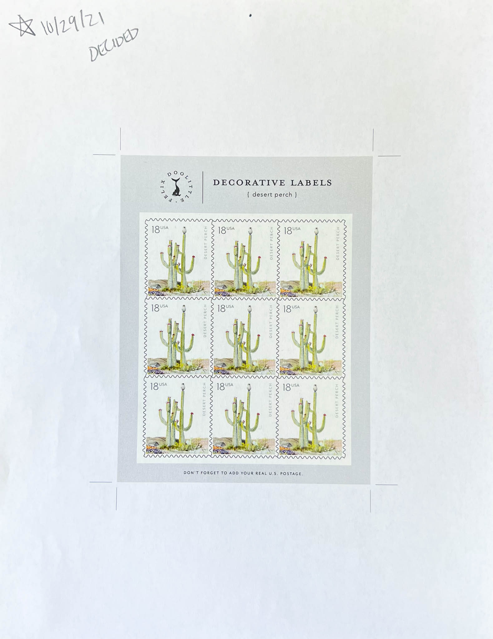
We tried out color, but ultimately decided on dove grey for our sheets to let the illustration truly shine
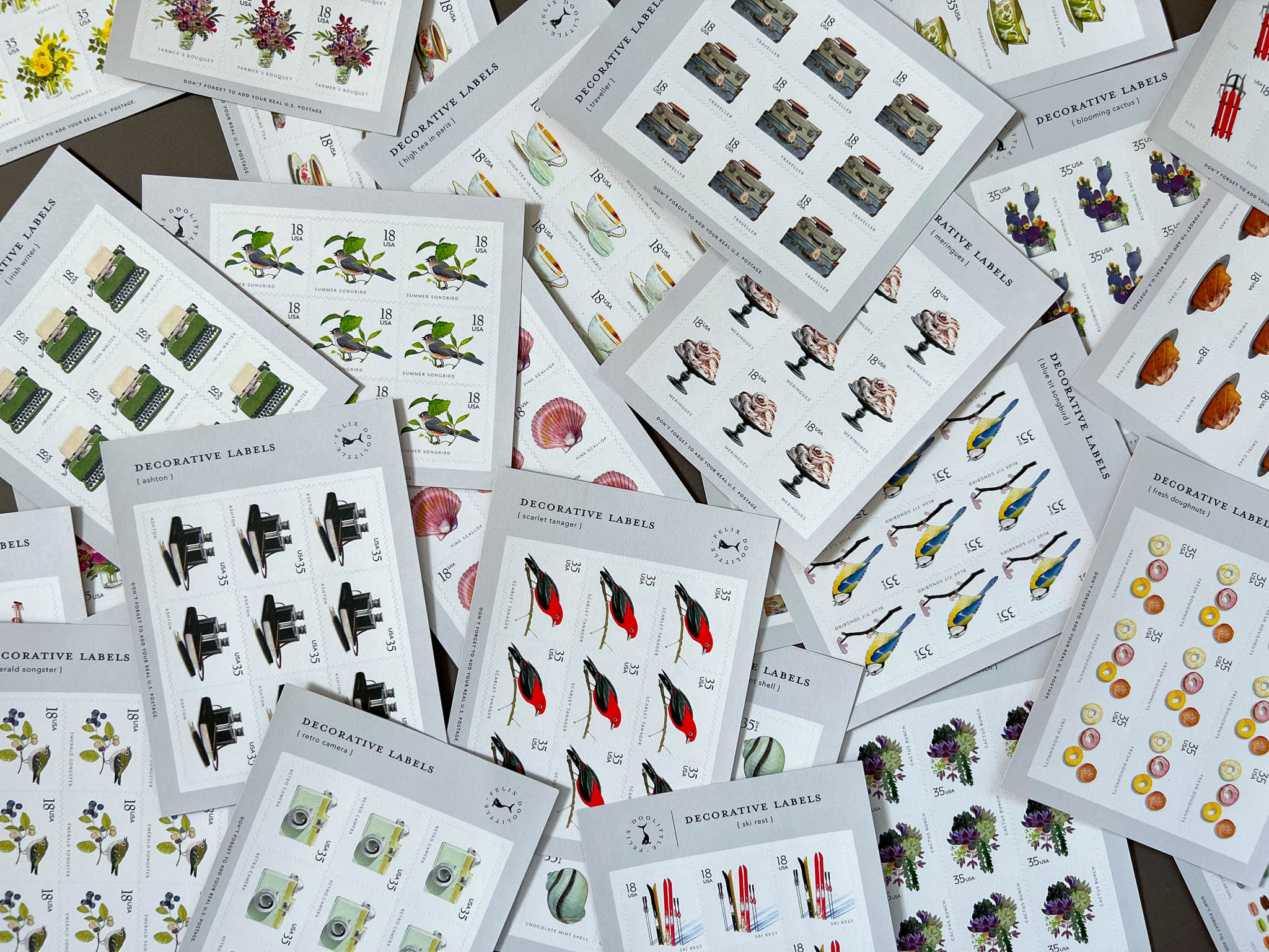
Our final label sheets, full of miniature Felix Doolittle illustrations
With the label sheets in production, our focus shifted to designing the packaging for our labels. The company’s owner, Felix, knew that he wanted these labels to come in an envelope, given the nature of these faux stamps. We thus started working on the language and content that would go on these envelopes, deciding the names for each of our label sets.
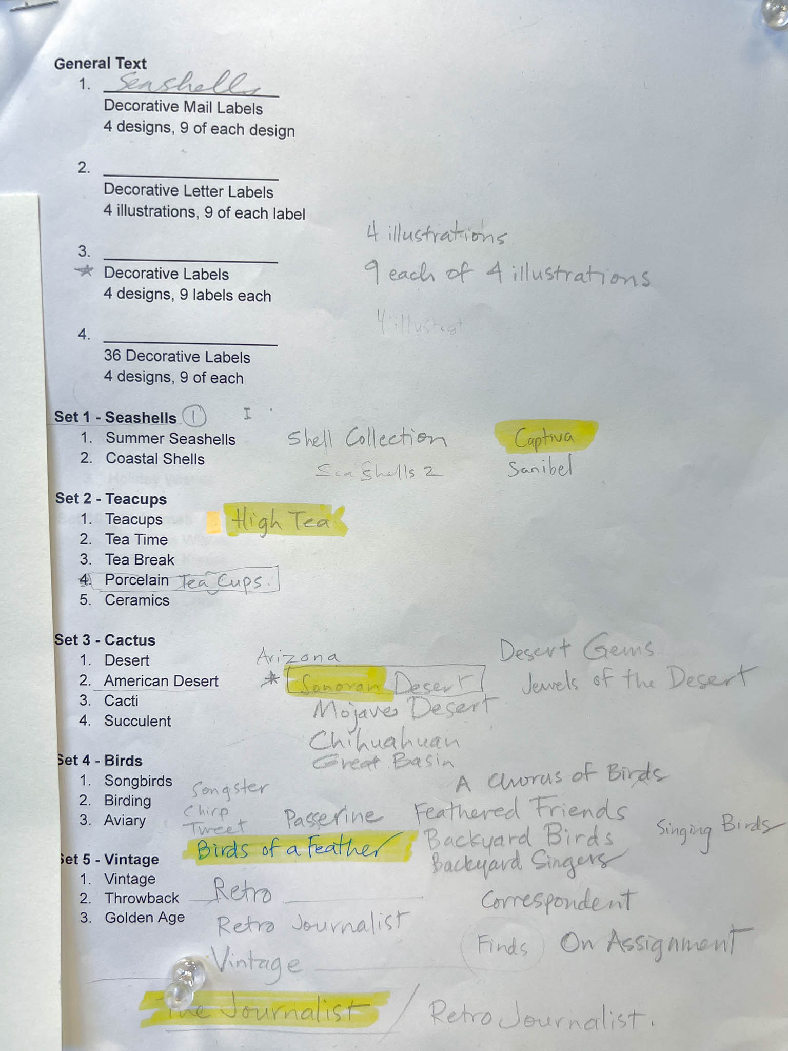
It always takes some effort to come up with a name that feels right for new products
My first envelope mockup used a calligraphic typeface as placeholder text, with a note on the back flap to “write to us,” along with the Felix Doolittle studio address. After some discussion, I improved this design by adding a barcode to the back flap for easy retail checkout, along with tweaking the phrasing on the front of the envelope, and making the fake postage mark a little more aged.

The first draft of Decorative Label packaging
Then, Felix wrote out the envelope phrasing in calligraphy, and we took this writing and dropped it onto our packaging, substituting the script placeholder font. We went back and forth on whether the calligraphy should be in black or brown, but decided on black for ease of reading. I also digitally dropped the stamps onto the front, finishing off the design for proofing.


There was a lot of interation and prototyping before deciding on a final envelope design
The printed colors on our first round of proofs needed quite a bit of tweaking. We ended up getting around 5 versions of proofs, as we needed to get all our colors on the packaging to accurately reflect the color of the illustrations on the product. With some persistence, we were finally able to land on correct colors for each envelope, and ordered the full run of the packaging.
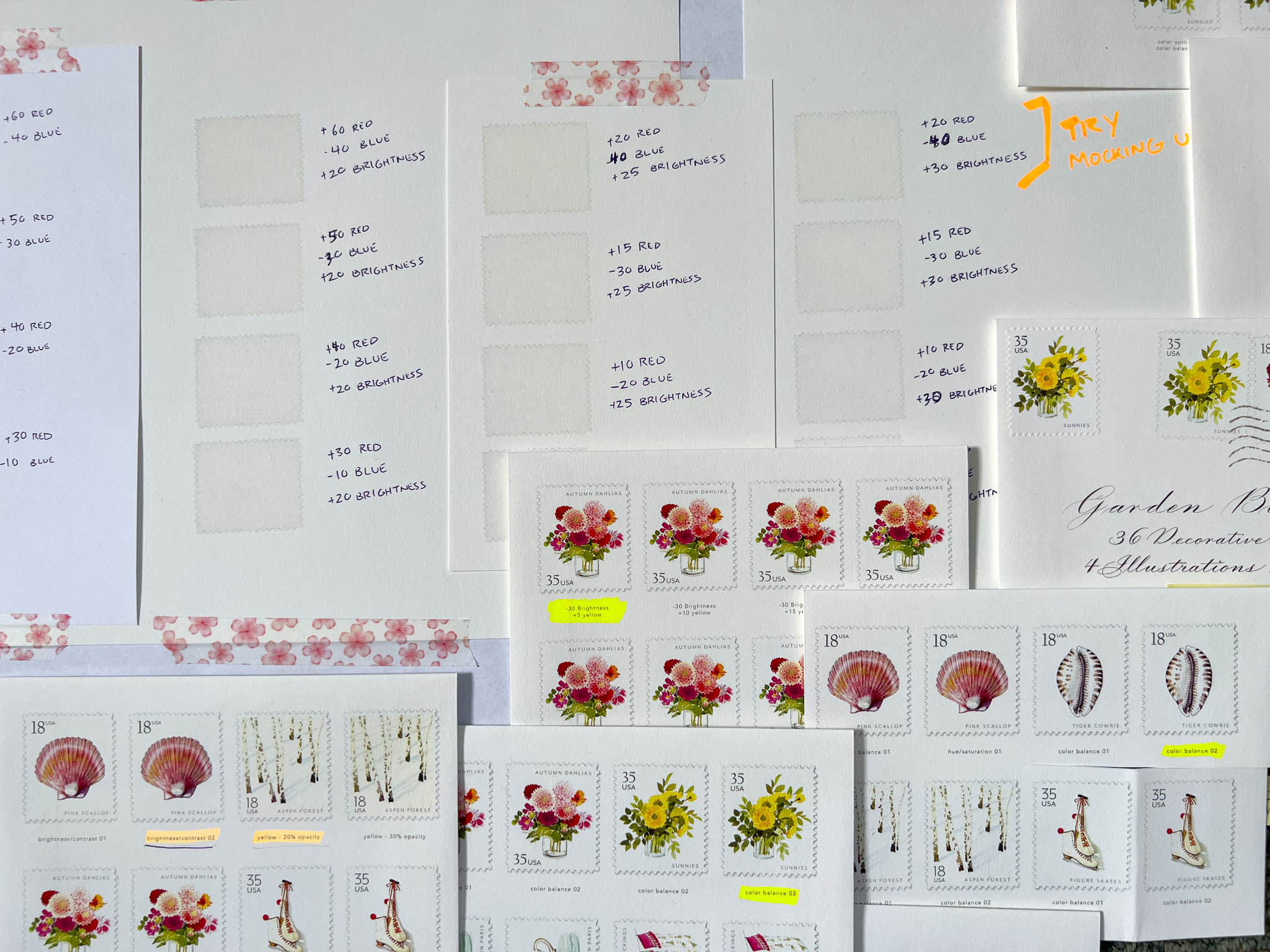
We edited colors in Photoshop multiple times over before getting the printing correct
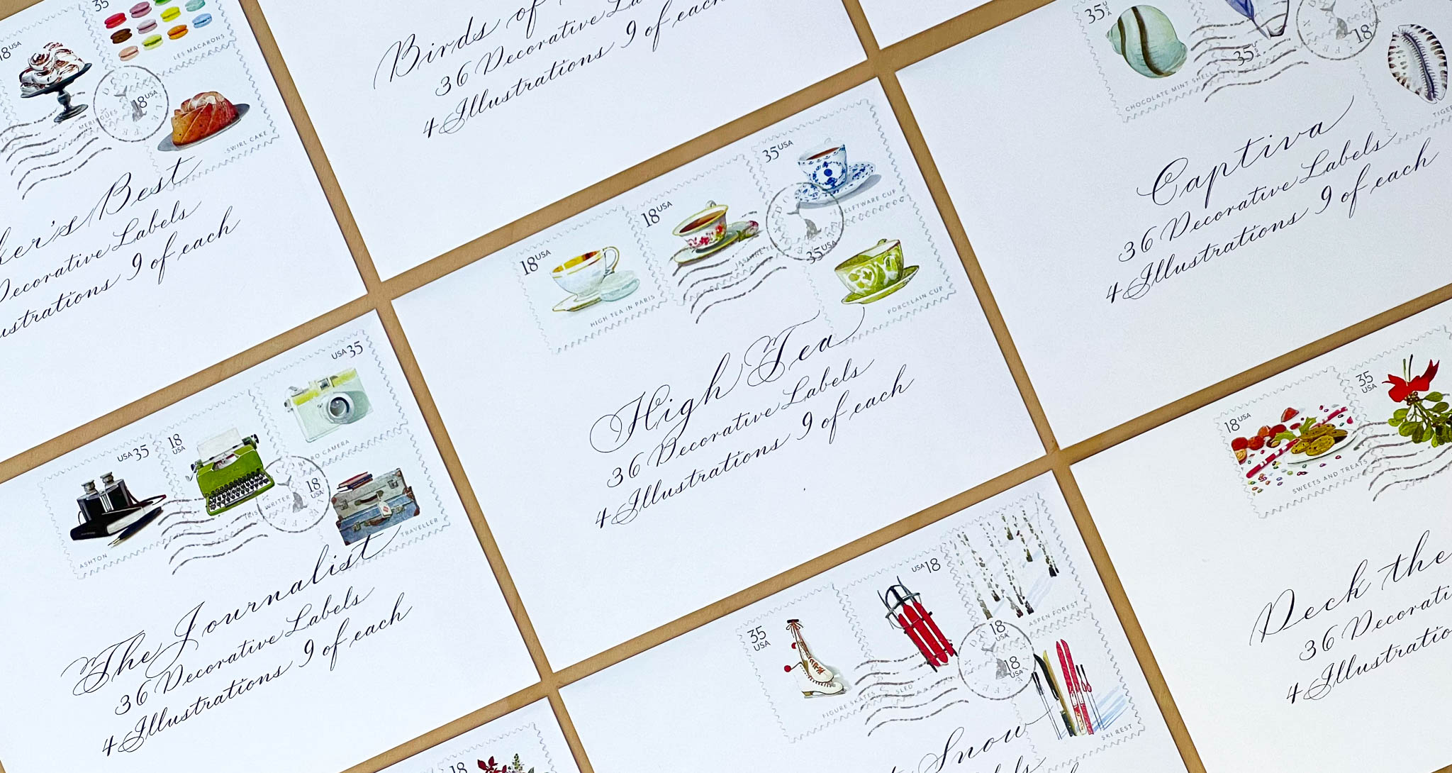
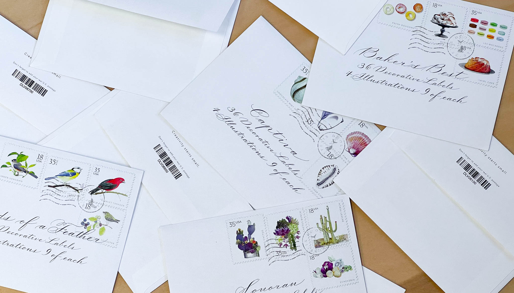
Our final Decorative Label packaging design
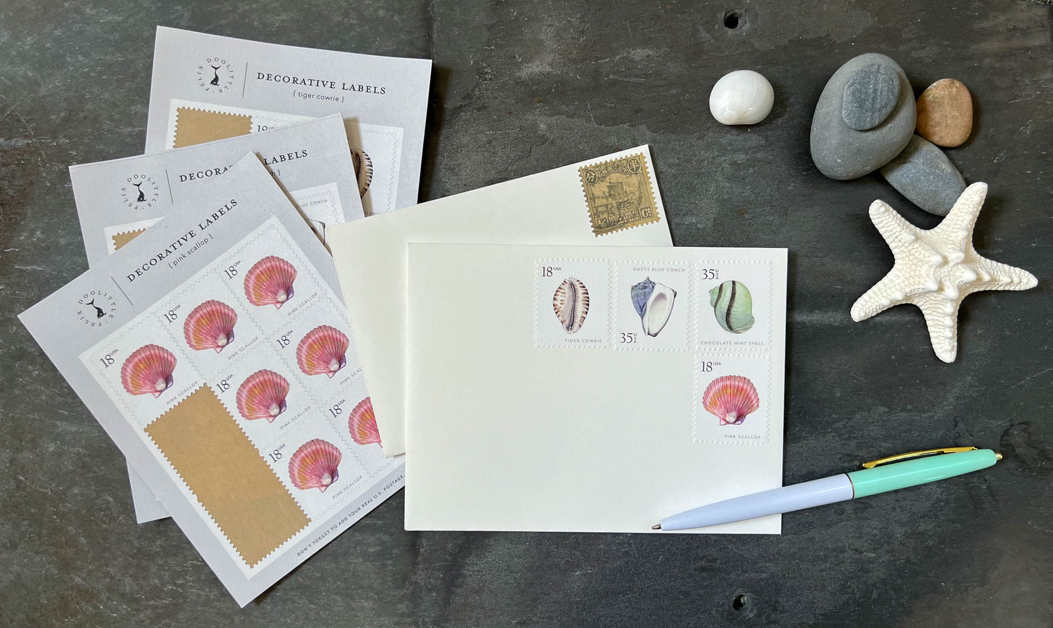
Our labels add a decorative element to envelopes or scrapbooks